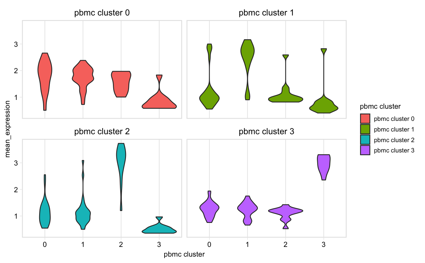
Make a grid of violin plots with the mean expression of each cluster, for markers dataset 1 is the sample whose expression values will be plot, and dataset 2 is the sample whose cluster markers are used.
pairwiseVln(seurat1, markers, seurat2,
  sample_names = c(seurat1@project.name, seurat2@project.name),
  marker_col = "gene")
Arguments
| seurat1 | Seurat object for which to plot expression |
|---|---|
| markers | Data frame as returned by Seurat::FindAllMarkers() |
| seurat2 | Seurat object from which cluster markers ( |
| sample_names | (Optional) Character vector giving the names or ID of the two samples, used for axis labels, etc. Default: c(seurat1@project.name, seurat2@project.name) |
| marker_col | String specifying the column in the |
Value
A ggplot object
Examples
pairwiseVln(pbmc, markers_pbmc, pbmc)