Load the package
library(cytobox)Here is a quick overview of some of the most useful functions available in cytobox for exploring single cell RNA-seq data stored in a Seurat package. It’s not an exhaustive list of the functions, or all the options, so see the documentation for more details.
Basic visualizations
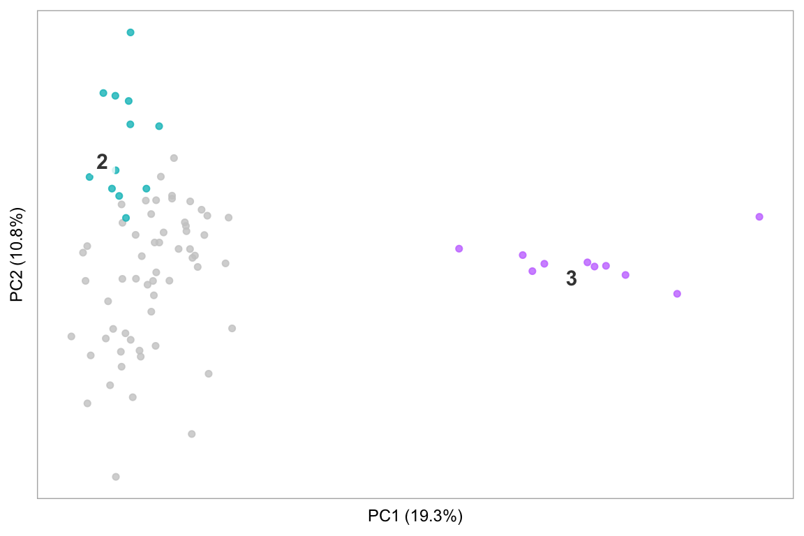
t-SNE/PCA
Basic t-SNE of a dataset (like Seurat::TSNEPlot()), or PCA:
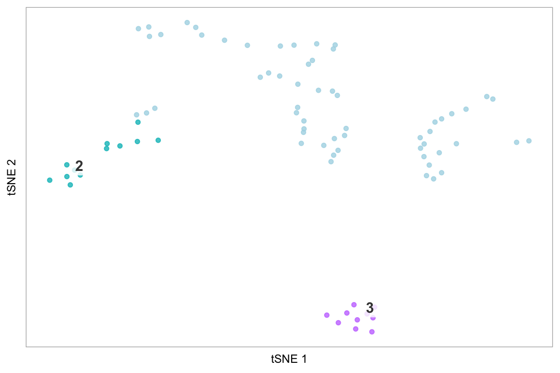
tsne(pbmc)
tsne(pbmc, label_repel = FALSE)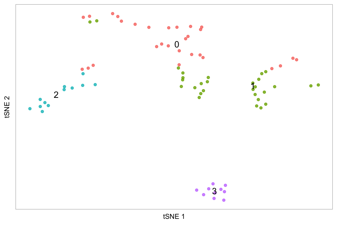
pca(pbmc, label_repel = FALSE, point_size = 2)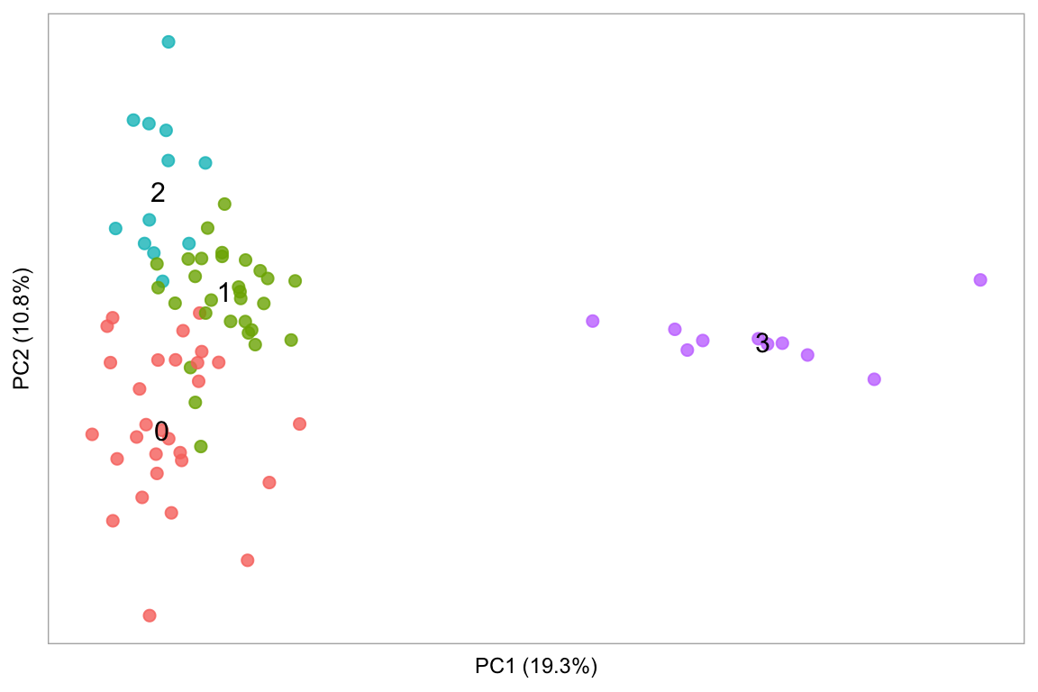
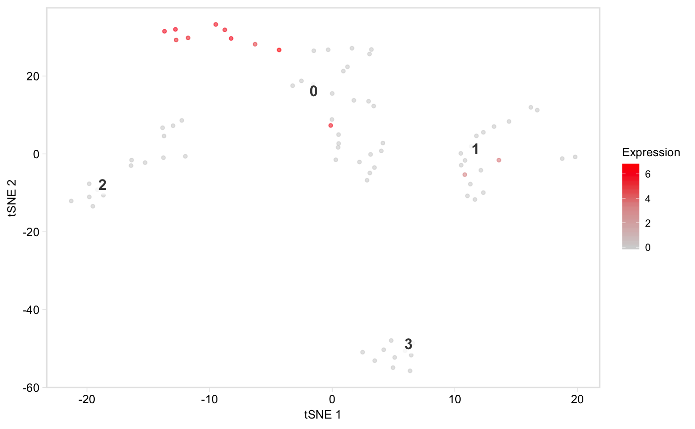
Colour the cells by a column in seurat@meta.data containing a continuous variable, e.g. the number of UMIs:
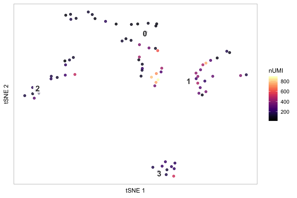
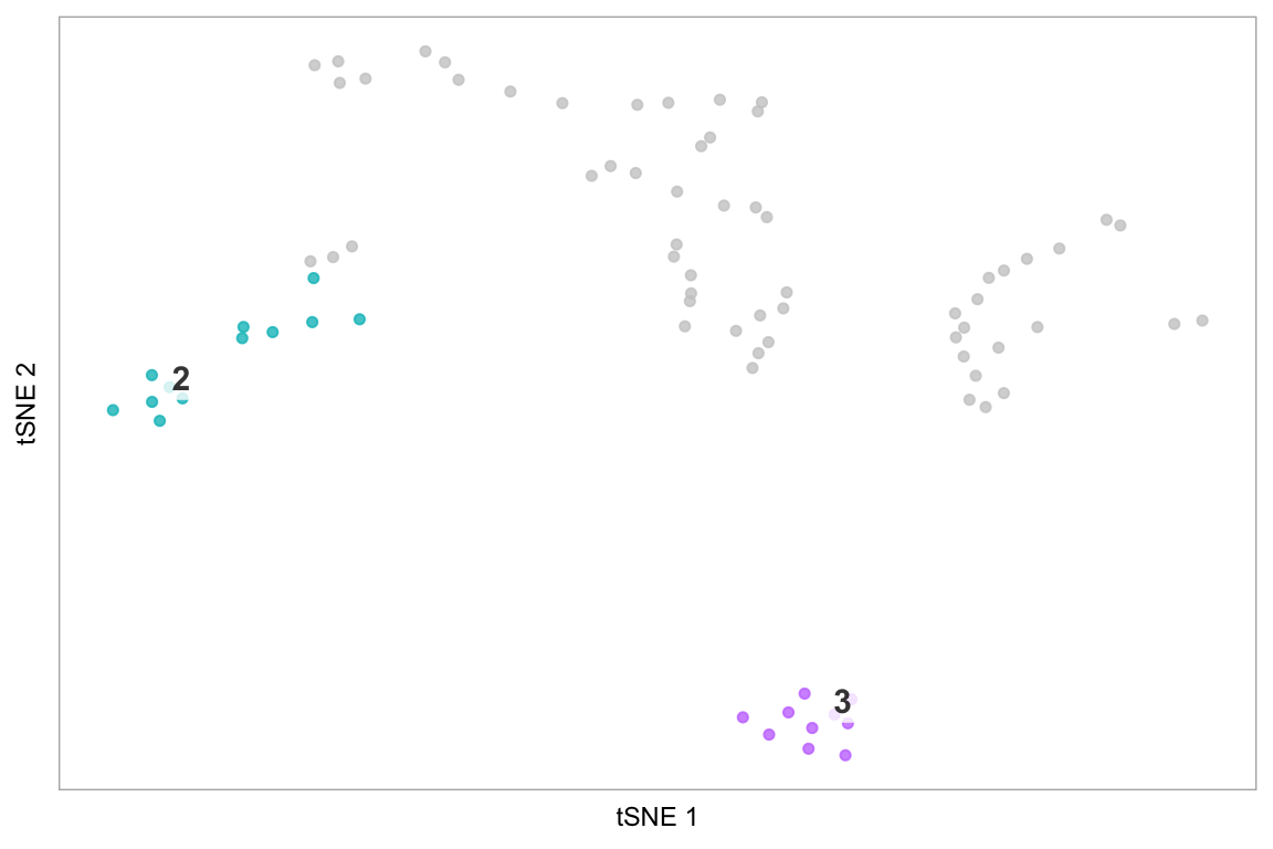
Only plot specified cells, say the cells in clusters 1 or 2, coloured by nUMI:
cells_keep <- whichCells(pbmc, clusters = c(1, 2))
cells_keep
#>  [1] "TACGCCACTCCGAA" "CTAAACCTGTGCAT" "CATCATACGGAGCA" "TTACCATGAATCGC"
#>  [5] "ATAGGAGAAACAGA" "GCGCACGACTTTAC" "ACTCGCACGAAAGT" "ATTACCTGCCTTAT"
#>  [9] "CCCAACTGCAATCG" "AAATTCGAATCACG" "CCATCCGATTCGCC" "TCCACTCTGAGCTT"
#> [13] "CTAAACCTCTGACA" "GATAGAGAAGGGTG" "CTAACGGAACCGAT" "AGATATACCCGTAA"
#> [17] "TACTCTGAATCGAC" "GCGCATCTTGCTCC" "GTTGACGATATCGG" "ACAGGTACTGGTGT"
#> [21] "GGCATATGCTTATC" "CATTACACCAACTG" "TAGGGACTGAACTC" "AAGCAAGAGCTTAG"
#> [25] "GGTGGAGATTACTC" "CGTAGCCTGTATGC" "CCTATAACGAGACG" "ATAAGTTGGTACGT"
#> [29] "ACCAGTGAATACCG" "ATTGCACTTGCTTT" "CTAGGTGATGGTTG" "CATGCGCTAGTCAC"
#> [33] "TTGAGGACTACGCA" "CATATAGACTAAGC" "TTTAGCTGTACTCT" "GACATTCTCCACCT"
#> [37] "ACGTGATGCCATGA" "ATTGTAGATTCCCG" "GATAGAGATCACGA" "AATGCGTGGACGGA"
#> [41] "GCGTAAACACGGTT"

tsne(pbmc,
     colour_by = "nUMI",
     colour_by_type = "continuous",
     colours = viridis::magma(100),
     # Provide a vector of cell names
     highlight_cells = cells_keep,
     show_all_cells = FALSE,
     # Only label these two clusters
     clusters_to_label = c(1, 2))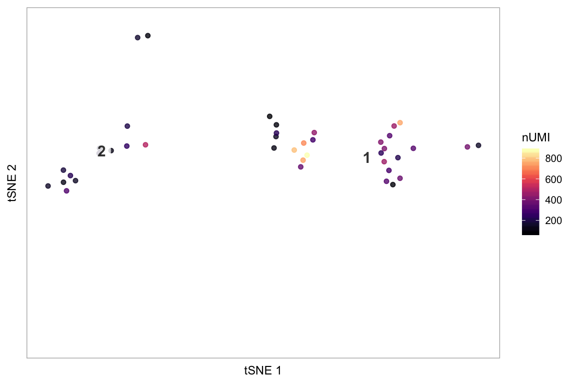
Colour the cells by a column in seurat@meta.data containing a discrete variable, e.g. here, the resolution 1.0 cluster assignments:
tsne(pbmc, colour_by = "res.1", colour_by_type = "discrete",
     # Getting some colours from a Color Brewer palette
     colours = RColorBrewer::brewer.pal(length(unique(pbmc@meta.data$res.1)), "Dark2"))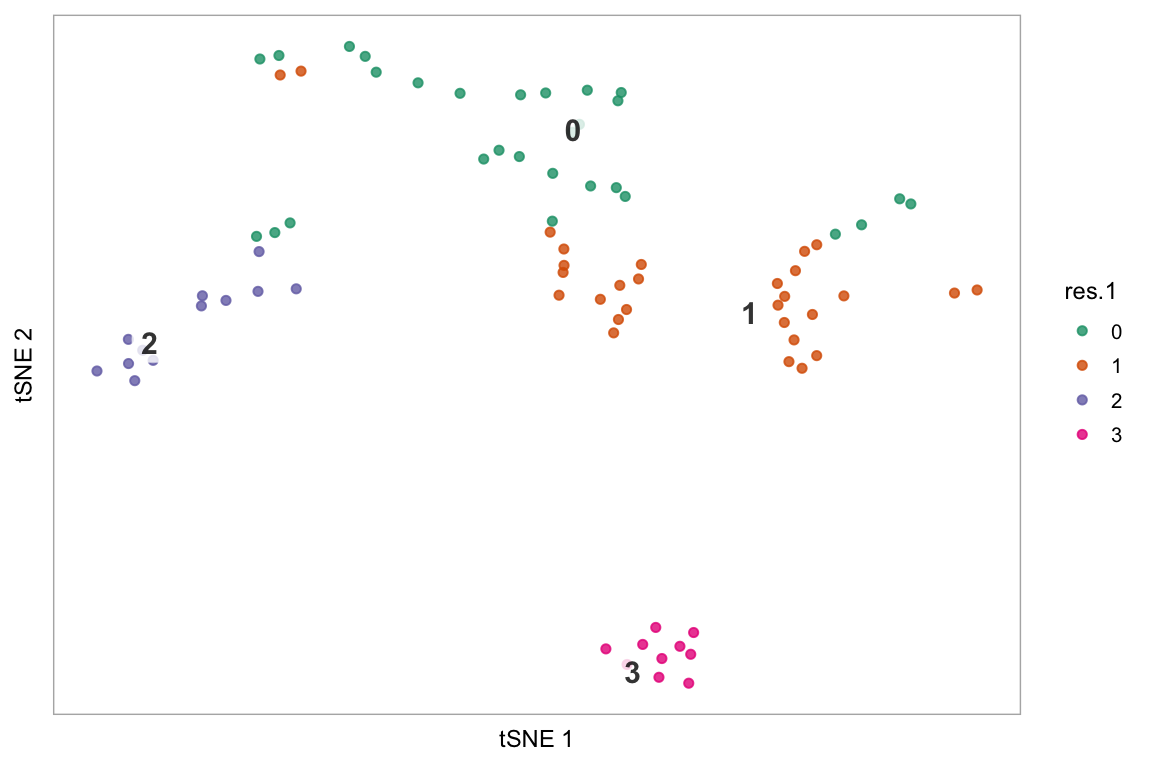
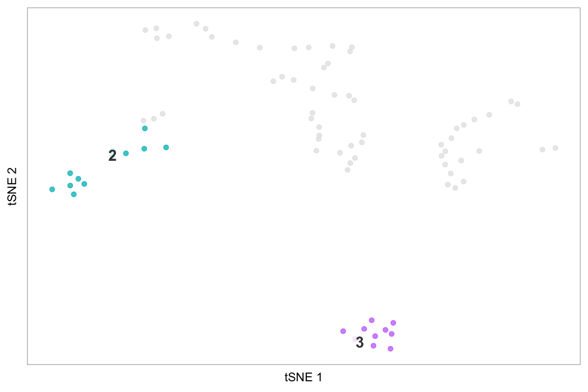
Highlight cluster in t-SNE space
The last example demonstrates how to only plot specific cells, using the string “none” - this is more effective than making the default colour “white”, because it avoids cells coloured white being plot on top of cells we have coloured, which becomes important in areas of high density of cells.
# Highlight cluster 3 on the tSNE plot
highlight(pbmc, 3)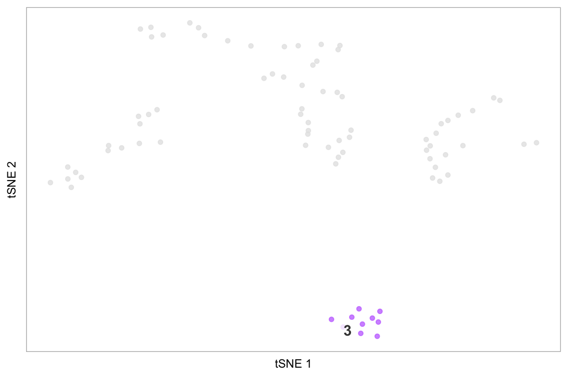
# Pass additional arguments to cytobox::tsne
highlight(pbmc, c(2, 3), label = FALSE, title = "Test highlight")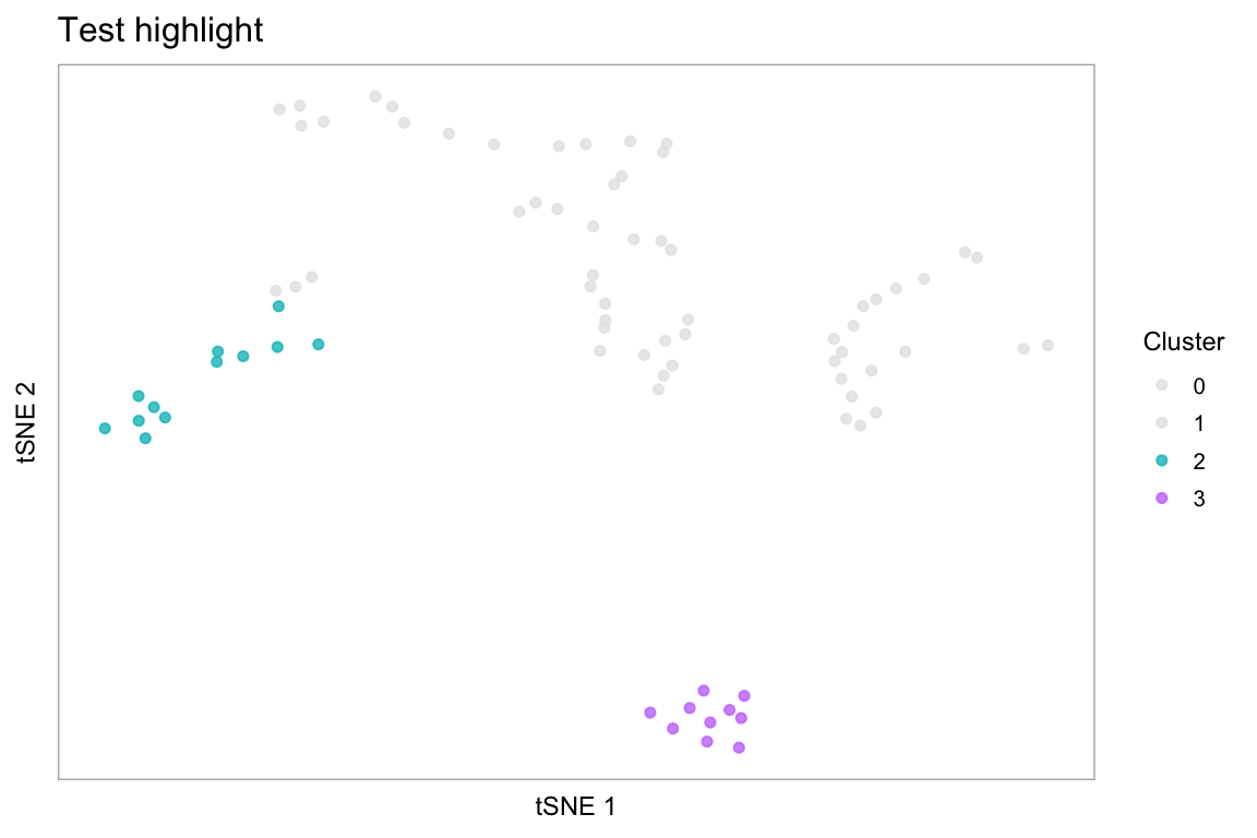
Computed visualizations
Plot a t-SNE coloured by mean marker expression, feature-plot style:
tsneByMeanMarkerExpression(pbmc, c("IL32", "CD2"))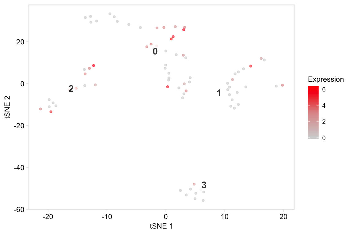
Plot a t-SNE coloured by percentiles marker expression
tsneByPercentileMarkerExpression(pbmc, c("IL32", "CD2"))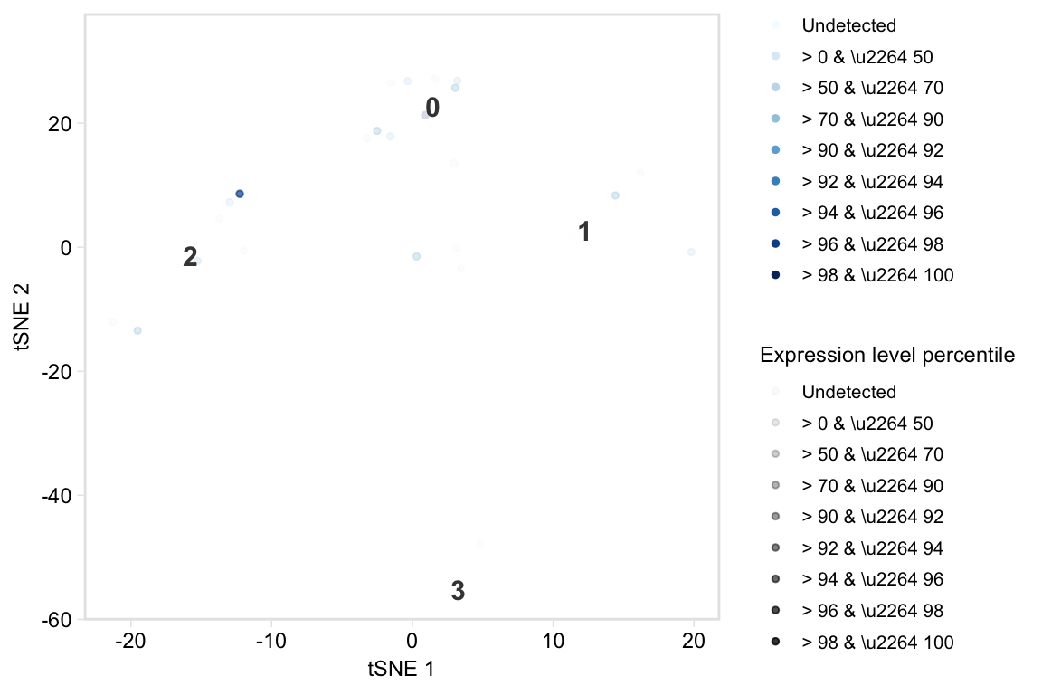
# No labels
tsneByPercentileMarkerExpression(pbmc, c("IL32", "CD2"), label = FALSE)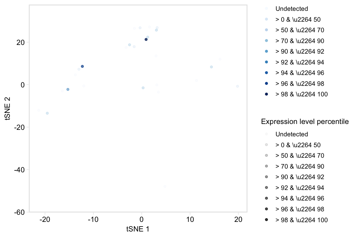
# Use values in legend instead
tsneByPercentileMarkerExpression(pbmc, c("IL32", "CD2"), label = FALSE,
                                 legend_options = "values")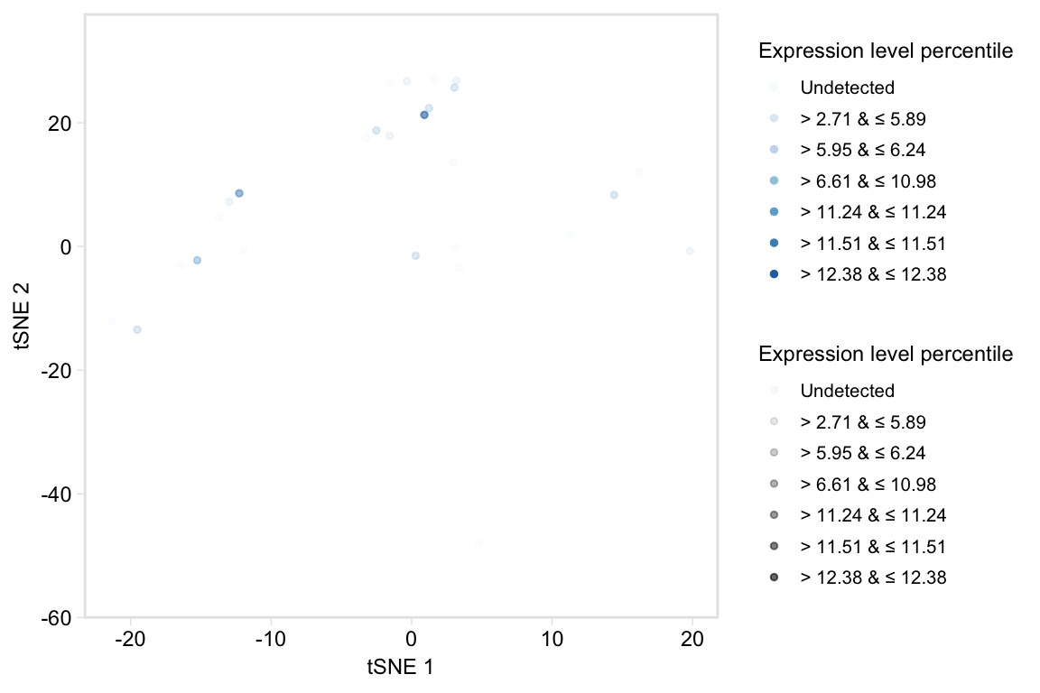
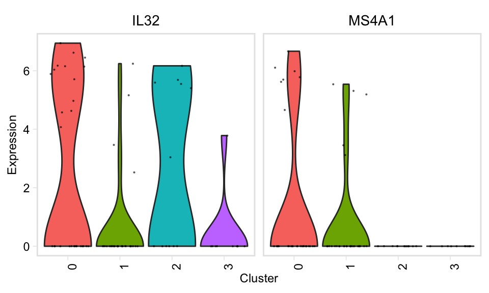
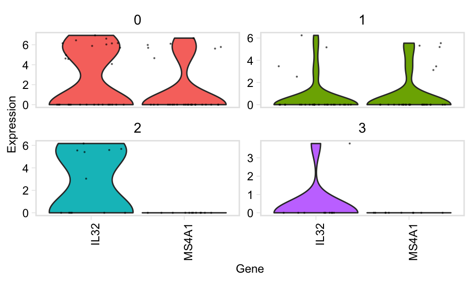
Dashboard plot, which gives a bit more distributional information than tSNE:
tsneByPercentileMarkerExpression(pbmc, c("IL32", "CD2"), label = TRUE, extra = TRUE, verbose = TRUE)
#> Computing percentiles...
#> Constructing percentiles plot...
#> Computing frequencies...
#> Constructing bar plot...
#> Computing means...
#> Constructing ridge plot...
#> Combining plots...
#> Picking joint bandwidth of 0.749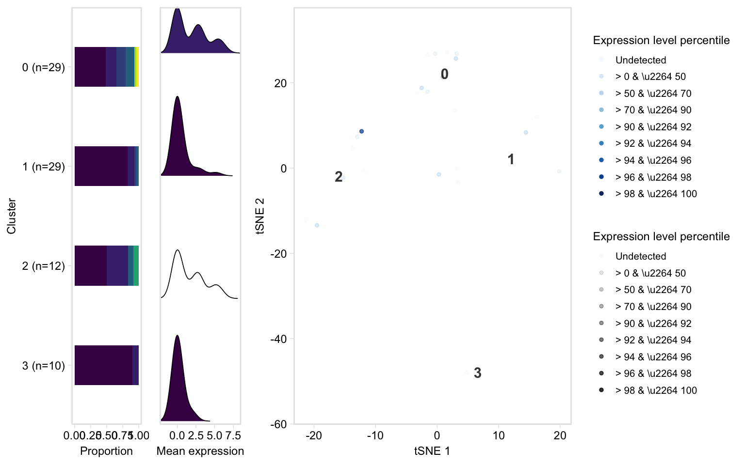
# This function is a shortcut for the above
dashboard(pbmc, c("IL32", "CD2"), title = "test genes")
#> Picking joint bandwidth of 0.749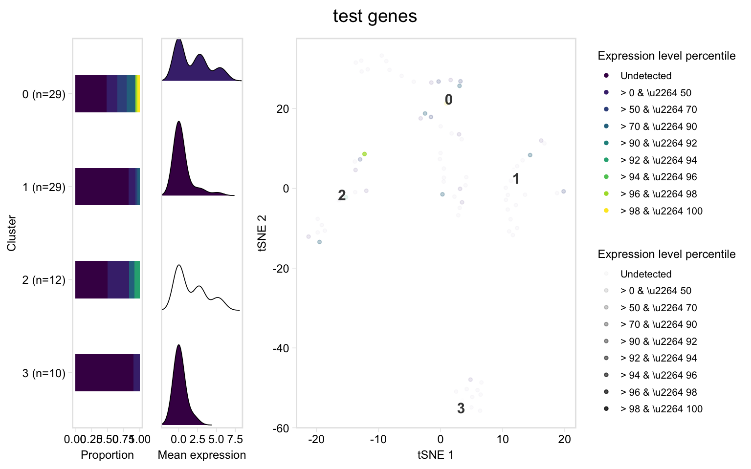
Notes:
- This doesn’t look good with few clusters; for a real sample with ~ 15 clusters, a good set of dimensions is width = 14, height = 8
- Known issue: the dashboard plots throw a big warning related to the unicode symbols. Do warning = FALSE in the chunk options to not print it.
Feature plot, akin to Seurat::FeaturePlot()
tsneByPercentileMarkerExpression(pbmc, c("IL32", "CD2"), label_repel = FALSE, palette = "redgrey", alpha = FALSE, point_size = 1, legend = FALSE)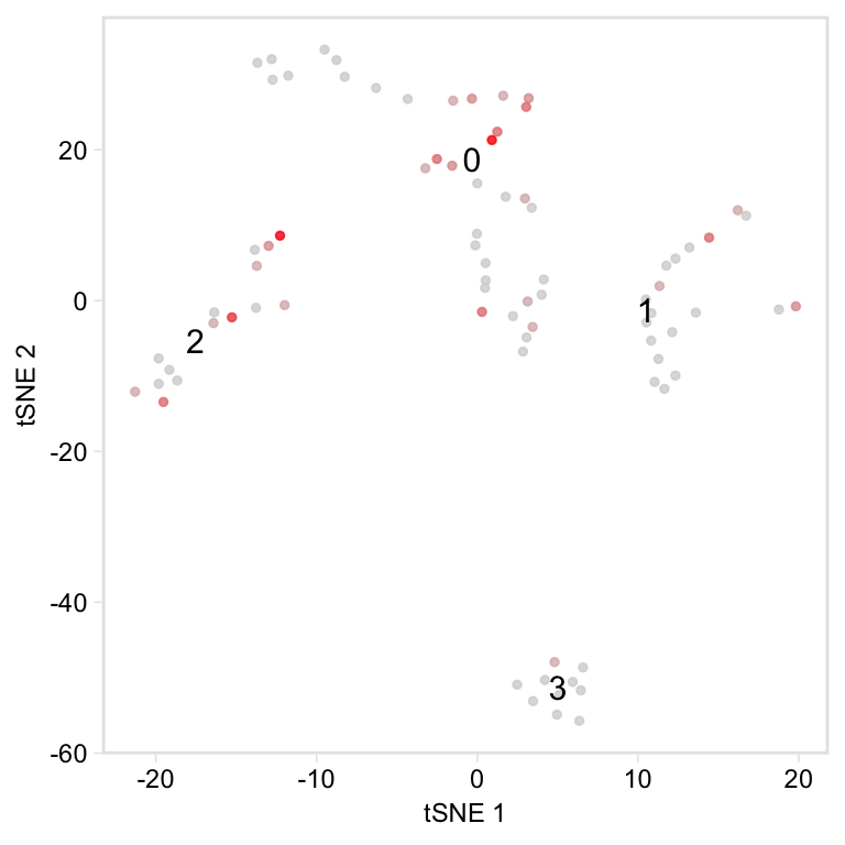
# This function is a shortcut for the above, except by default it makes one plot
# per gene (set per_gene = FALSE like below to have one plot with the summary statistic)
feature(pbmc, c("IL32", "CD2"), per_gene = FALSE)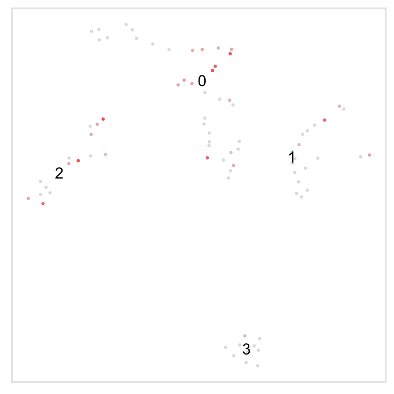
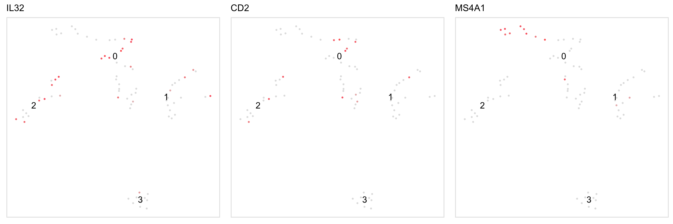
Feature plots for individual genes:


Two-sample plots
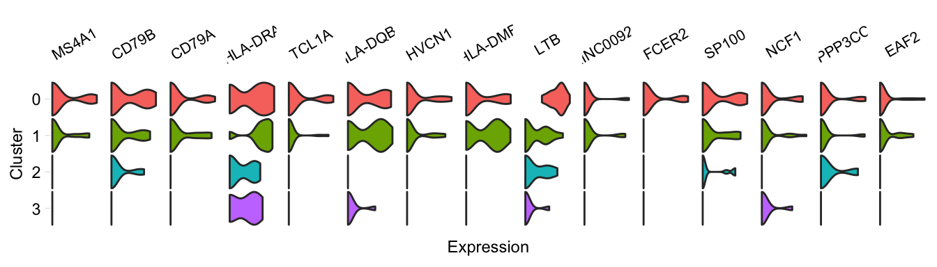
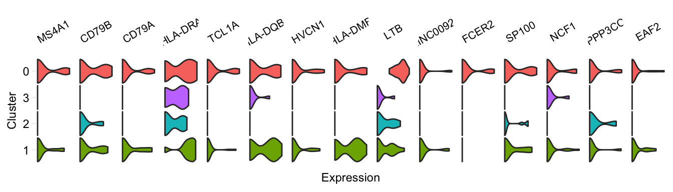
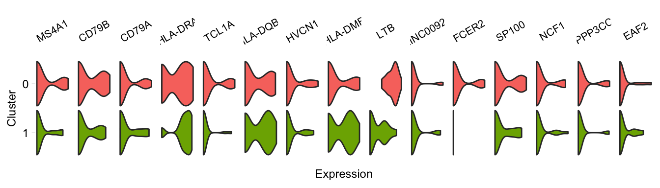
Pariwise violin plot
pairwiseVln(pbmc, markers_pbmc, pbmc, sample_names = c("PBMC1", "PBMC2"))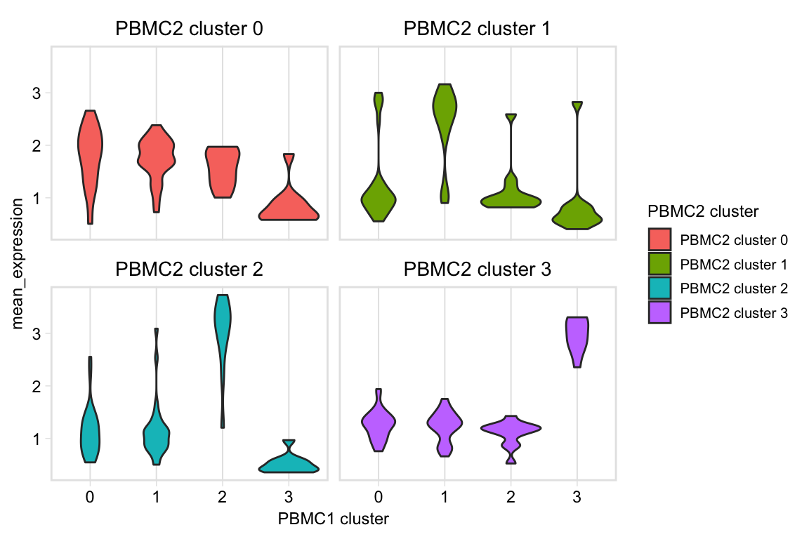
Heatmaps of marker overlap
We may be interested in shared markers between clusters in two samples. When calculating this value, we can use as the denominator of the equation either the number of markers in sample 1 or the number of markers in sample 2. This function provides a few options for what to plot in the heatmap, in the mode argument:
- “s1”: Plot the percentage of sample 1 markers which are also markers in sample 2
- “s2”: Plot the percentage of sample 2 markers which are also markers in sample 1
- “min”: Plot the minimum of the above percentages
- “max”: Plot the maximum of the above percentages
- “both”: Plot two heatmaps, one with the percentage of sample 1 markers which are also markers in sample 2, and one the percentage of sample 2 markers which are also markers in sample 1
By default, the function plots the minimum (here, comparing one dataset to itself):
heatmapPercentMarkerOverlap(markers_pbmc, markers_pbmc,
                            sample_names = c("PBMC1", "PBMC2"),
                            # The default for this argument is set to the column name
                            # of output of our pipeline, which is 'external_gene_name'
                            marker_col = "gene")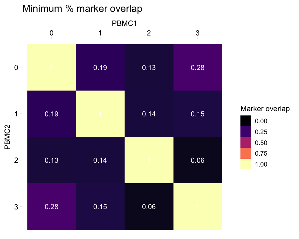
# Change the palette: give a set of colours to interpolate, from low to high
heatmapPercentMarkerOverlap(markers_pbmc, markers_pbmc,
                            sample_names = c("PBMC1", "PBMC2"),
                            marker_col = "gene",
                            palette = c("white", "red"))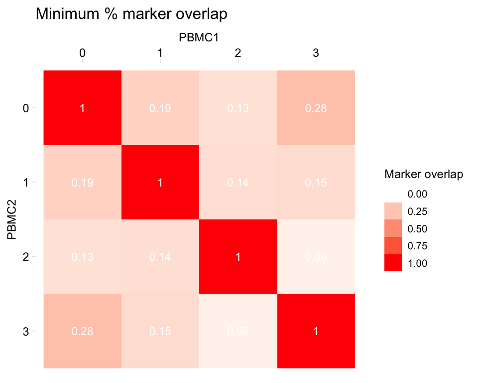
# You can use RColorBrewer palettes like this
heatmapPercentMarkerOverlap(markers_pbmc, markers_pbmc,
                            sample_names = c("PBMC1", "PBMC2"),
                            marker_col = "gene",
                            palette = RColorBrewer::brewer.pal(8, "OrRd"))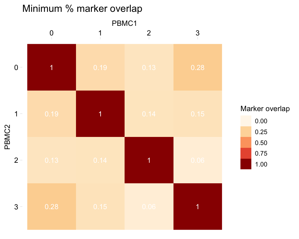
# Different label colour
heatmapPercentMarkerOverlap(markers_pbmc, markers_pbmc,
                            sample_names = c("PBMC1", "PBMC2"),
                            marker_col = "gene",
                            palette = RColorBrewer::brewer.pal(8, "OrRd"),
                            label_colour = "black")
# Plot the max instead
heatmapPercentMarkerOverlap(markers_pbmc, markers_pbmc, mode = "max",
                            sample_names = c("PBMC1", "PBMC2"),
                            marker_col = "gene")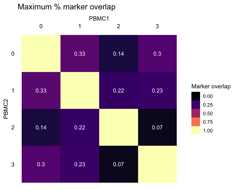
Plot both:
heatmapPercentMarkerOverlap(markers_pbmc, markers_pbmc, marker_col = "gene", mode = "both")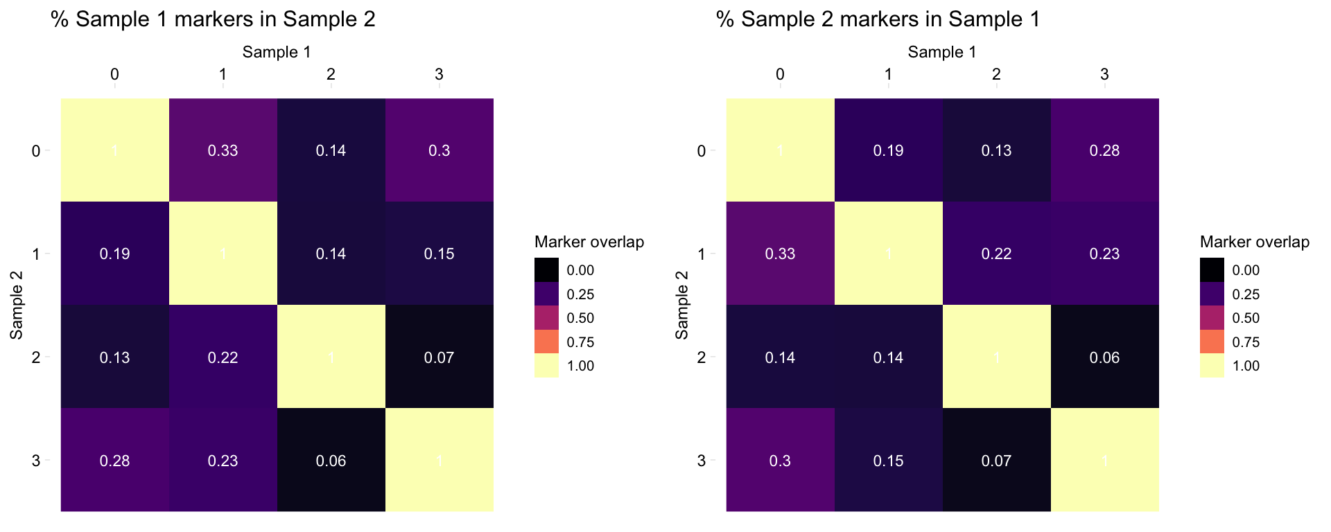
Utilities
Subset data by gene and cluster:
head(fetchData(pbmc, "IL32", c(1, 2)))
#>   IL32
#> 1    0
#> 2    0
#> 3    0
#> 4    0
#> 5    0
#> 6    0
head(fetchData(pbmc, c("IL32", "MS4A1"), c(1, 2), return_cluster = TRUE, return_cell = TRUE))
#>             Cell Cluster    MS4A1 IL32
#> 1 TACGCCACTCCGAA       1 5.313305    0
#> 2 CTAAACCTGTGCAT       1 5.190573    0
#> 3 CATCATACGGAGCA       1 5.537982    0
#> 4 TTACCATGAATCGC       1 0.000000    0
#> 5 ATAGGAGAAACAGA       1 0.000000    0
#> 6 GCGCACGACTTTAC       1 0.000000    0
cytobox tells you if you try to plot genes which are undetected in the data:
tsneByMeanMarkerExpression(pbmc, c("MS4A1", "foo"))
#> NOTE: [foo] undetected in pbmc